Trust isn’t a feature. It can’t be tacked onto a release, or fixed in an update, or delivered in a sprint. Trust is the sum of all the design decisions made in all the screens, interactions and pixels of a product. Trust is the most important result of good design to us at 8ration and that means every mobile app design is centered around the UX design principles required for trust. In this blog, we’ll explain how we do it.
Key Takeaways
- Trust is not a feature; it is the outcome of every UX decision across the product.
- Users trust apps that are clear, consistent, responsive, and predictable in every interaction.
- UX principles like clarity, consistency, feedback, honesty, accessibility, and performance directly shape user trust.
- Small UX issues compound over time and lead to user drop-off and loss of confidence.
- Lack of feedback or slow response makes users feel the app is broken or unreliable.
- Transparency in data, permissions, and pricing builds long-term user loyalty.
- Accessibility improves usability for all users and is a core design requirement, not an add-on.
- Performance directly affects perception, slow apps reduce trust immediately.
- Most apps fail because they ignore error states, edge cases, and post-launch behavior.
Why Trust Matters More than Metrics
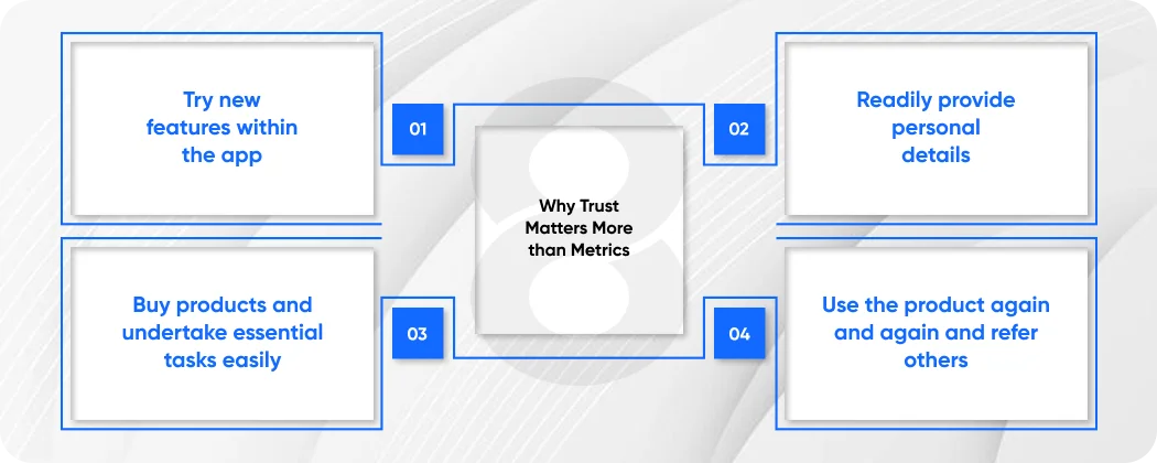
Product teams have many numbers they focus on: conversion rates, retention, time on site, and Net Promoter Scores. These numbers matter. But there is one number that underpins these that either glues them together or tears them apart: trust.
Users trust an app because they:
- Try new features within the app
- Readily provide personal details
- Buy products and undertake essential tasks easily
- Use the product again and again and refer others
If trust is lost due to a confusing screen, broken interaction, or even a dark pattern, users abandon. And they never return. It’s harder to regain trust than to get it in the first place.
The principles of user experience that create trust are not always visible. They’re not what’s hot in design. But they underpin the products that users love. At 8ration, we call them the iron-clad principles.
Principle 1: Be Clear Before You are Clever
The most basic of all design principles UX teams should follow is the obvious one: be clear before you are clever.
There’s always a temptation to be clever in product design, to surprise users, to introduce a pattern that is different or an icon that is abstract in the name of being memorable. But when cleverness is confusing, it isn’t design. It’s friction.
Clarity means:
- Users are always oriented in the app
- All labels, buttons and actions are clearly identified
- Users know what will happen when they take any action
- Menus are always consistent and predictable
Clarity is particularly important for mobile app design. Mobile users are easily distracted, multi-tasking, and have short attention spans. If they can’t understand the screen in three seconds, they will leave. Any confusion is a drain of attention, and attention is a scarce resource in mobile UX.
At 8ration, we test each screen for clarity before it’s developed. The question is simple: does a novice user know what’s required of them within three seconds? If not, it’s back to the drawing board not for the developer to tweak, but for the designer to re-imagine.
Read More: Top 10 Mobile Apps for Businesses in 2026
Principle 2: Consistency Begets Familiarity
Of all the principles of UX design, consistency is the stealthiest and most powerful. When the app works the same way regardless of the screen or the context, users don’t have to think about the interface. They use it seamlessly. It’s that place where the interface fades away and the task remains, where trust is born.
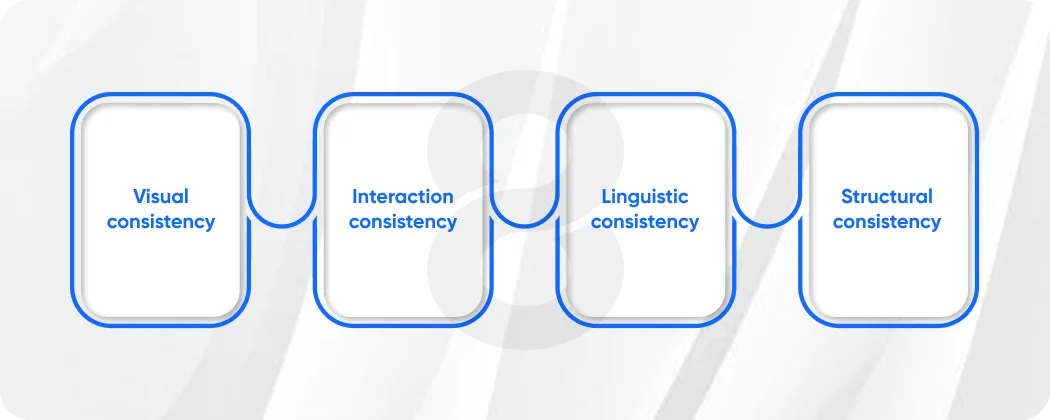
Consistency has multiple facets:
- Visual consistency: The same design system with the same colours, fonts, spacing and icons is used throughout the app
- Interaction consistency: All on-screen actions and gestures result in the same interaction
- Linguistic consistency: Actions are described using the same words, “Save” is always “Save” and not “Confirm” on one screen and “Submit” on another
- Structural consistency: Content of the same type is always displayed in the same structure
All 8ration products share a design system, a dynamic library of components, tokens, and interaction patterns that app designers and developers work from throughout the development process. This isn’t bureaucracy. It is trust infrastructure. It guarantees that regardless of the section of the app a user enters, it feels consistent.
If something is inconsistent, even if it is something small users notice. They may not be able to put their finger on it, but something isn’t right. That’s a withdrawal from the trust account. With enough small withdrawals, the account is shut down.
Principle 3: Feedback – The App Has to Respond
A key principle of user experience is feedback. The app must be responsive at all times. When they click something, it must do something and when an error occurs they have to be told, and what to do about it.
Silence is the enemy of trust. When an app doesn’t respond when it doesn’t show an hourglass, or a confirmation or an error message users are in the dark. And users in the dark make bad assumptions. They click again, causing the action to repeat and think the app is broken. They leave.
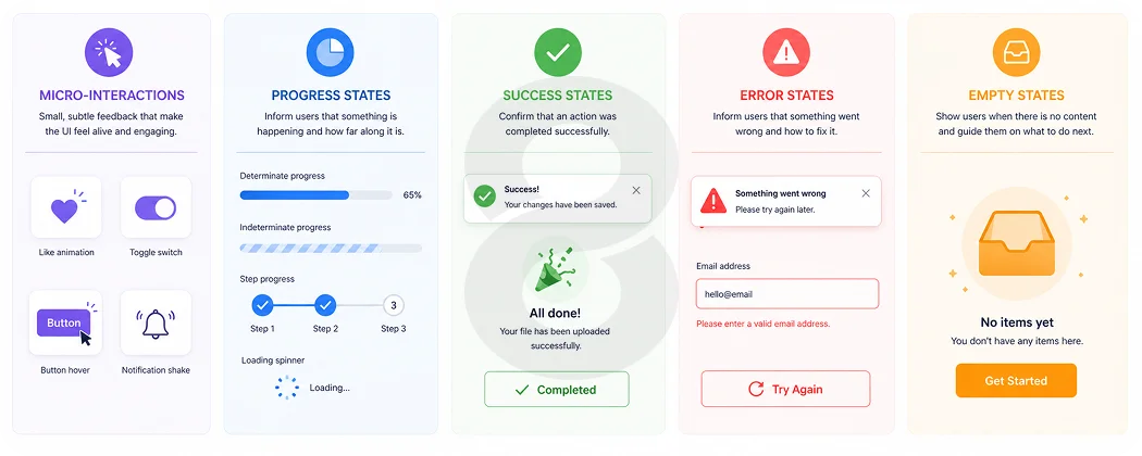
What makes feedback work in mobile apps is:
- Micro-interactions: Animations that indicate a tap, a switch, a swipe has been received
- Progress states: Feedback that something is happening; progress indicators if it’s a longer process
- Success states: Clear feedback that an action has been performed – an email sent, a form submitted, a payment processed
- Error states: Clear, easy-to-understand descriptions of the problem, and an obvious way forward
- Empty states: Carefully crafted screens for when there’s no content, helping the user take the next step rather than staring at a blank screen
At 8ration, feedback states are not tacked onto the main flow of work, they are designed simultaneously. All the possible states of a screen are designed for: loading, success, error, and empty. This is one of the most obvious ways in which we show respect for our users’ time and attention.
Read More: How to Choose the Right Mobile App Development Company
Principle 4: Honesty gets you ahead
These days we have an abundance of information about how apps use our data, how they earn a living, and what rights we are giving up in exchange for a product. And they should be wary. They are trusting of the apps that are open about what they are doing and why.
Making transparency the design principle UX designers must follow means:
- Only asking for what you need – and explaining why you need it, when it’s asked for
- Clearly stating what data is being collected and how it will be used, in clear, simple terms, not in legalese
- Allowing easy management of privacy, notification and account settings, as well as data
- Never burying costs, trial periods or auto-renewals in confusing terms or dark patterns
This final point is key. Dark patterns design decisions that trick users into doing something other than what they intended are an easy way to permanently lose trust. Pre-checked boxes, hidden cancellation processes, hidden subscriptions: these might win you conversions in the short run, but they’ll damage your reputation in the long run and are almost impossible to recover from.
At 8ration, we do transparency audits as part of every design audit. We ask, is there anything here that might surprise or mislead a user after the fact? If so, we redesign it period.
Read More: How to Create an App: 8 Steps to Build an App in 2026
Principle 5: Don’t Skimp On Accessibility
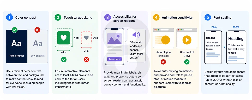
Accessibility is often positioned as a compliance issue something to check off before shipping. We think of it differently at 8ration: accessibility is a UX design principle that makes products better for all users.
Designing for people with visual, motor or cognitive disabilities reveals problems with clarity and usability that impact all users. Black text on white is easier to see on a sunny day. Bigger buttons are easier to hit for everyone, not just people with motor impairments. Concise, clear text benefits those with language differences, as well as cognitive impairments.
For mobile app design, accessibility means:
- Color contrast: Minimum of WCAG AA standards for text, buttons and other interactive elements
- Touch target sizing: Minimum 44×44 points for buttons and other interactive elements
- Accessibility for screen readers: Descriptive alt text, correct use of headings and focus order
- Animation sensitivity: Offering a reduced-motion option for users who are sensitive to animations
- Font scaling: Making sure the design works and is readable with increased system font size
It’s faster to build accessibility into products than add it later. More importantly, it communicates to all users: this solution is for you. That message is trust.
Read More: Mobile App Development Timeline: 2026 Guide
Principle 6: Predictability – Don’t Surprise Users (Unless It Delights Them)
There are subtleties in the principles of UX design, but one is close to an ironclad rule: don’t surprise users in a bad way. Don’t alter the behavior of a gesture. Don’t automatically take them where they don’t want to go.
Predictability is related to consistency, but it’s more than that, it’s about the user’s model of the system. Users develop a model of an app. The closer the map is to the territory, the more comfortable they are. The more it changes, the more uncertain and nervous they feel.
At 8ration, we ensure predictability through the following:
- Pattern libraries that prevent interaction models being arbitrarily changed
- User testing that is done for any substantial navigation or interaction change
- A/B testing that rolls out changes in stages, so users can learn to navigate them
- In-place tutorials for completely new interactions, so users don’t have to find out the changes themselves
Surprise is an essential part of great mobile software design, but it must be the surprise of delight, not the surprise of function. A delightful progress bar, a bit of humor in an empty state, and the sound of completion: these are the surprises that breed love. Unexpected actions in major interactions are the surprise that breeds contempt.
Read More: How to Hire a Full Stack Developer in 2026
Principle 7: Performance is a Metaphor for Quality
Performance is a UX issue. This is a fundamental and often overlooked user experience principle in practice. If an app is slow, it says something to the user, even if they don’t put it into words: this product doesn’t value my time. Delays erode confidence. They introduce doubt. They make interactions painful. And in mobile app design, where users are in time-constrained situations, a delayed response is often the last response.
Trust by speed means the following:
- Users’ perception of speed is managed, not just the real speed; skeleton screens and progressive loading mean apps load faster even when they don’t
- User flows are ruthlessly prioritized; the most common flows must be the fastest
- Offline scenarios are managed properly, with appropriate messaging and caching
- Images, animations and other large assets never slow down the responsiveness of key interactions
At 8ration, we define performance budgets during the mobile app design process, not through retrofitting. This means that design choices are always balanced with their impact on UX.
Putting It All Together: Trust as a Design Practice
The UX design principles outlined in this post are not a to-do list. They are a culture, a lens through which to view the entire process of digital product design and development.
To put it simply, 8ration’s design principles apply to every app it produces:
- Clarity: Every screen is instantly comprehensible without explanation
- Consistency: Every interaction adopts a coherent system of behavior and language
- Feedback: Every action is immediately acknowledged and responded to helpfully
- Transparency: Every request, permission, and fee is clearly stated
- Accessibility: Every user, regardless of ability, can navigate and use the product effectively
- Predictability: Every interaction aligns with the user’s expectations of the app
- Speed: Every action is fast and efficient thanks to performance optimization
Where Most Products Get It Wrong
Knowing what good UX mobile app design principles are is one thing. Knowing where most products don’t is another. From our work auditing and redesigning products across different sectors, the biggest trust killers are:
- Releasing products without error states designed teams focus on the happy path and launch, and then users are stuck when things fail
- Adding accessibility after launch, when it’s five times more expensive
- Including permission requests without context, so users deny them, and the product fails because they don’t understand the value proposition
- Using different terms than engineers: “Archive” for the design team and “Hide” for engineering and the user doesn’t know where their things are
- Not designing and testing for low-end devices, building on top-end devices and releasing a subpar version to the bulk of the device population
These are not edge cases. They are patterns throughout the industry. And they are all avoidable through the rigorous application of the principles of user experience from the beginning of development.
Read More: 9 Steps for Startups to Hire the Right App Development Agency
Design Review Process by 8Ration
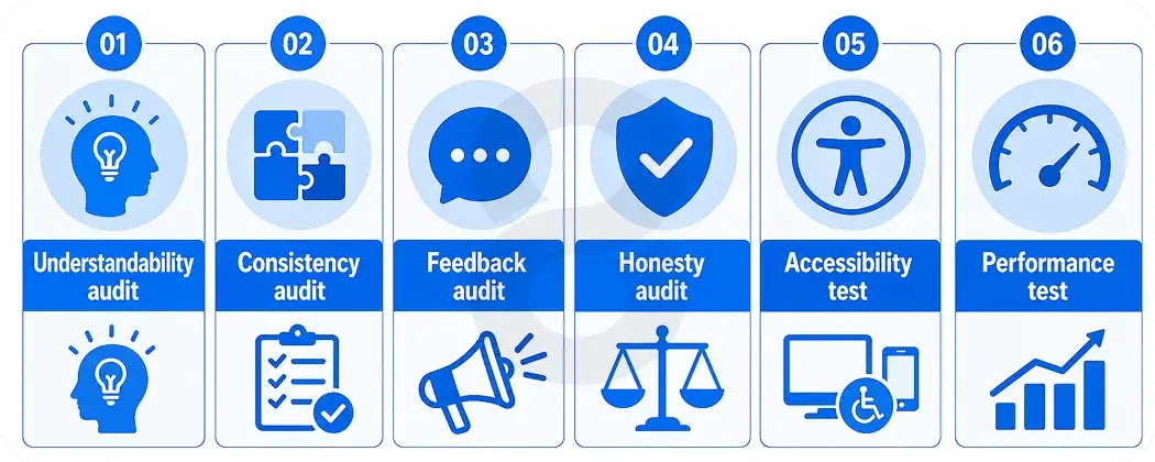
Good intentions are not what keep the trust process alive. Our design process includes a design review for all products before they are released, which includes:
- Understandability: Is every screen instantly recognizable?
- Consistency audit: Is there any interaction that doesn’t follow the design system?
- Feedback audit: Are all of the states, like “loading,” “success,” “error,” and “empty,” covered?
- Honesty audit: Is it possible for the user to be deceived or tricked at any point in any flow?
- Accessibility test: Does it meet WCAG AA criteria and screen reader tests?
- Performance test: Does the product meet its performance budget on target devices?
This is not a red-tape game. It is the good design principles that UX teams subscribe to to become reliable and deliverable.
Final Thoughts: Trust Is a Long Game
The UX design principles outlined in this post are not to be read and then checked off a to-do list. They are a discipline, a mindset that needs to be ingrained in the team culture of every product that people use. Mobile app design is a long game when it comes to trust. It is earned over time, with hundreds of decisions that users don’t notice because they were successful. At 8ration, we have chosen to go the long route. Every application we release is a testament to the people who entrust us with the products we create and to the quality of the products we deliver.
The qualities we have described, clarity, consistency, feedback, transparency, accessibility, predictability, and speed, are not goals. They are operational requirements. They are the principles of good design.
Because ultimately, the best thing we can do is to do what the user thinks we’re going to do. But no more. That predictability, time after time, screen after screen, release after release, is what we mean when we talk about trust in design. And that’s what we strive to achieve with every app 8ration delivers.