There’s a particular kind of exhaustion that hits after your SaaS product launches and you watch the activation numbers. You spent months getting the thing built. The feature set is solid. The demo went well. And then people sign up, poke around for five minutes, and leave. Quietly. No drama, no feedback, just gone.
This isn’t a hypothetical. Amplitude’s 2025 Product Benchmark Report, spanning over 2,600 companies, found that more than 98% of new users who never reach a value milestone churn within two weeks. Two weeks. And the average B2B SaaS activation rate sits at 37.5%, meaning fewer than four out of every ten signups ever experience what the product was built to do for them.
That’s not a marketing problem. That’s a design problem. Specifically, it’s what happens when custom web app design for SaaS gets treated as a visual exercise rather than a product strategy. The screens look clean, the palette is on brand, and somehow nobody knows what to do when they land on the dashboard for the first time.
This article walks through how the web app design process actually works when it’s done with SaaS retention in mind from the start. Not in theory. In practice.
Why SaaS Startups Keep Getting Web App Design Wrong
Honestly, it starts with timing. Most founders treat design as something that happens after the product is mostly built, with developers already three sprints in and the backend architecture locked, before someone says they should probably make it look better, leading to a UI coat of paint over a workflow that was never designed to be intuitive in the first place.
The result is predictable. Statista projects the global SaaS market at $512 billion in 2026. That means there are a lot of tools competing for the same user’s attention. When your onboarding takes 25 minutes before a single useful thing happens, users don’t complain. They open another browser tab with a competitor.
The other major mistake is confusing complexity with quality. SaaS dashboards filled with charts, menus, filters, and toggles feel impressive in a demo. To a first-time user staring at an empty state at 9am on a Tuesday, it feels like homework.
There’s also a tendency in startup app development to treat the MVP as a minimum viable design. It’s fine to ship a lean product. It’s not fine to ship a confusing one. The interface isn’t a placeholder you’ll fix after growth. It’s the thing users interact with while deciding whether to stay or leave. And most of them decide within the first session.
The real cost of poor design
Here’s the math that should make any founder stop scrolling. If customer acquisition costs $900 per user and 75% of those users abandon within the first week, that’s $675 lost per failed onboarding.
Scale that across 1,500 annual signups and you’ve burned over a million dollars before any of those users reached their second month. That figure comes from aggregated research across SaaS platforms and it’s not an outlier. It’s the median experience for products that didn’t design their onboarding as a first-class product concern.
And only 19.2% of users complete onboarding checklists on average, with a median of just 10.1%. That means the majority of your signups never reach the activation milestone you built the whole first-run experience around.
| Design Mistake | What Users Experience | Impact on Retention |
|---|---|---|
| Feature overload in onboarding | Confusion in the first 5 minutes | Users form “this is complicated” impression that’s hard to reverse |
| No clear first action | Empty dashboard paralysis | Drop-off before any value is experienced |
| Design added after development | Unintuitive navigation, mismatched flows | High support volume, low repeat login rate |
| Mobile not considered until later | Broken layouts on smaller screens | Immediate loss of mobile users |
| No design system in place | Inconsistent UI across features | Users perceive the product as unreliable |
How Web App Design Works When It’s Built for SaaS
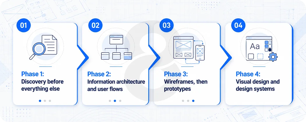
The web app design process for SaaS is different from designing a marketing site or a mobile app. The stakes are different, the user behavior is different, and the failure modes are different. A SaaS user is coming back every day. Or they’re supposed to. That changes what “good design” means at every stage.
Phase 1: Discovery before everything else
This phase gets skipped more often than it should. Founders come in with the product mostly planned, the tech stack chosen, and a Figma file started. The instinct is to move fast. The problem is that moving fast with the wrong assumptions just means reaching the wrong destination sooner.
A serious discovery phase for custom web app design for SaaS covers a few things. First, who exactly is the primary user and what does their existing workflow look like? Not what they wish their workflow looked like, what it actually looks like right now. That’s a user research question, not a product intuition question.
Second, what is the one thing a new user needs to accomplish to understand why this product matters? This is sometimes called the “aha moment” and it’s not a metaphor. It’s a specific action. For Slack it was sending a message to a teammate and seeing a reply. For Dropbox it was saving a file and watching it appear on another device. Every SaaS product has one, and every design decision in the onboarding flow should exist to get users there as fast as possible.
Third, where are users most likely to get stuck? This is where competitive analysis and user journey mapping earn their keep. You’re not trying to copy how competitors do it. You’re trying to understand the category’s common failure points so you can design around them.
The discovery phase typically produces user personas, a defined activation event, a rough information architecture, and a list of assumptions that need to be tested before development starts. It’s not glamorous work. But it’s the work that keeps the whole project from having to be rebuilt in six months.
Phase 2: Information architecture and user flows
Before anyone opens a design tool, the structure of the product needs to be mapped out. Information architecture is just a formal way of saying: what screens exist, what lives on each one, and how does a user move between them?
For SaaS, this matters especially because products tend to accumulate features over time. The ones that stay navigable do so because the underlying architecture designers design to accommodate growth. The ones that become confusing do so because each new feature teams bolt onto wherever it seems to fit at the time.
User flows at this stage are drawn without any visual design attached. Just boxes and arrows. Where does a user land after signup? What’s the first action they’re prompted to take? What happens if they skip the setup step? What does an empty state look like when no data exists yet? These decisions made on paper are much cheaper than the same decisions made after a developer has written two weeks of code.
Phase 3: Wireframes, then prototypes
Wireframes are low-fidelity. They’re meant to show structure and hierarchy without the distraction of color, typography, or imagery. At this stage, the question is whether the layout makes sense and whether the most important actions are visible without scrolling or hunting.
A lot of teams skip straight to high-fidelity mockups. The problem with that is people start giving feedback on the wrong things. “Can we make the button more blue?” instead of “I don’t understand why this step comes before that one.” Keep wireframes rough enough that the conversation stays focused on flow and function.
Prototypes come after the wireframes have been validated. A clickable prototype lets real users (or at least someone who isn’t on the team) attempt to complete a core task. Watch where they hesitate, what they click first, and where they stop. That data is worth more than any amount of internal discussion about what users “probably” want to do.
Phase 4: Visual design and design systems
This is where custom web app design for SaaS gets its actual visual identity. Color, typography, component styling, spacing, iconography. The goal here is not to win a design award. The goal is consistency and clarity.
For SaaS products specifically, a design system matters from the start. Not just a style guide. A system: a library of reusable components (buttons, forms, modals, cards, tables) that all behave predictably and look like they belong together. Without this, every new feature that gets designed looks slightly different from the last one, and users pick up on that inconsistency even if they can’t name it. Moreover, it’s the sensation that something feels off about a product, and it corrodes trust in ways that are hard to trace back to any single screen.
Moreover, accessibility should be baked in here, not added as a checklist item at the end. Contrast ratios, keyboard navigation, screen reader compatibility. These aren’t niche concerns. They’re the baseline for any product that wants to serve users across a range of devices, contexts, and abilities.
| Design System Element | Why It Matters for SaaS | What Breaks Without It |
|---|---|---|
| Component library | Consistency across features and screens | New features feel like different products |
| Typography scale | Hierarchy guides user attention | Users don’t know what to read first |
| Color tokens | Semantic meaning (error, success, info states) | Colors lose meaning across the product |
| Spacing system | Visual breathing room and alignment | Screens feel cluttered and hard to scan |
| Interaction patterns | Users learn once, apply everywhere | Every feature requires re-learning how things work |
What a SaaS Startup Web App Design Agency Actually Does Differently
There’s a difference between an agency that can design things that look good and one that has built SaaS products before. The surface area of that difference isn’t always visible until you’re three months into a project.
A SaaS startup web app design agency that knows the space thinks about onboarding as a retention problem from day one, not a UX nicety to be addressed post-launch. They know that empty states need to teach, not just sit there being blank. Moreover, they know that form length directly affects conversion because the Baymard Institute’s form usability research shows that inline validation alone reduces error rates by 65% compared to post-submission validation. Furthermore, they know that users who don’t engage within the first three days have a 90% chance of churning.
These aren’t opinions. They’re the working knowledge that shapes design decisions. And they matter a lot for end-to-end product development where design and engineering decisions interact constantly.
Read More: Web App Design Pricing in 2026: Packages, Hourly Rates & What You Get
Designing Specifically for the SaaS User Journey
The SaaS user journey is different from an app someone uses once or twice. It’s a repeated relationship. Users log in every day. Or they stop logging in entirely. The design has to hold up across both the first session and the fortieth.
That means a few things practically. The onboarding flow needs a clear exit point. After the first experience of real value, users should feel capable, not still in tutorial mode. The dashboard needs to adapt as user data populates. Teams should replace empty states with genuinely useful content instead of leaving a blank canvas with a “get started” button.
Navigation should scale without becoming a maze. Many SaaS products start with five top-level navigation items and end up with fourteen. Teams need to anticipate that growth in the architecture rather than solve it later by cramming things into dropdowns.
Mobile responsiveness isn’t optional anymore either. Mobile-first design is one of the clearest SaaS product trends coming into 2025 and 2026, and it affects more than just layout. Touch targets, input fields, complex data tables, they all need to be reconsidered for the context of a phone screen, not just shrunk down from a desktop view.
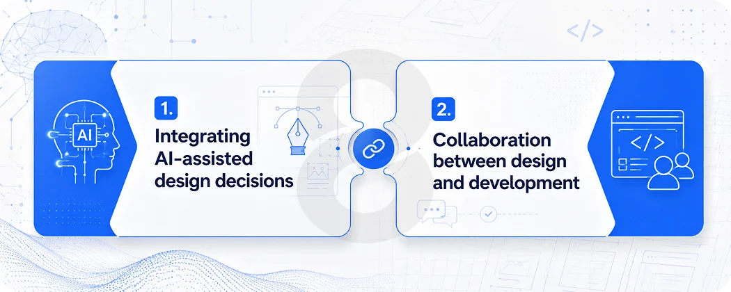
Integrating AI-assisted design decisions
This is newer territory, but it’s real. AI-powered features built into SaaS products, things like personalized onboarding paths, usage-based feature suggestions, and predictive empty states, require design work that goes beyond static screens. The UI needs to handle dynamic, user-specific content in a way that feels helpful rather than intrusive.
Gartner projects that more than 80% of companies will have deployed AI-enabled apps in their IT environments by 2026. That’s an enormous shift. Moreover, designing for AI output means designing for variability, different users will see different things, and the visual system needs to be robust enough to handle that gracefully.
Read More: How Custom SaaS Development Can Transform Your Business Operations
Collaboration between design and development
This is where good intentions fall apart most often. Design and development working in separate phases with a “handoff” in between is an artifact of an older way of working. For custom web app design for SaaS, design and engineering need to be in conversation throughout. Not because it sounds nice, but because the implementation constraints affect design decisions and the design decisions affect architecture choices.
A component-first approach helps here. When the design system is built with implementation in mind, and when the development team is involved in reviewing design components before they’re finalized, you end up with a product where what shipped matches what was designed. That sounds basic. It’s surprisingly rare.
| Stage | Design Output | Development Involvement |
|---|---|---|
| Discovery | User research, personas, IA draft | Technical feasibility review |
| Wireframing | Low-fi screens, user flows | Data model alignment check |
| Prototyping | Clickable prototype for user testing | Component scoping review |
| Visual Design | Design system, high-fi mockups | Component library setup begins in parallel |
| Development | Design QA throughout sprints | Feature build against agreed components |
| Post-Launch | Design iteration from user data | A/B testing implementation, analytics setup |
The Post-Launch Design Work That Most Startups Ignore
Launch is not the end of the design process. It’s the beginning of the part where you have real data. And real data almost always shows you that some of the things you were confident about were wrong.
Session recording tools like Hotjar or FullStory show you where users actually click versus where you designed them to click. Analytics show you where they drop off. Support tickets tell you what they couldn’t figure out. This is the feedback loop that turns a good product into a great one, but only if someone is actually closing the loop.
A/B testing for SaaS UI is underused in early-stage products. Teams often think it’s a scale tool, something for later. But the decisions that most benefit from testing, onboarding flow variants, CTA placement, empty state messaging, are all early-stage decisions. By the time you have enough scale to feel comfortable testing them, the damage from the wrong version has already been done.
Structured onboarding increases retention by 50%, according to research from UserGuiding. Products with a “quick win” built into the onboarding retain 80% more users. These are not marginal improvements. Also, they’re the difference between a product that grows and one that requires constant top-of-funnel effort just to maintain flat revenue.
Read More: What to Ask Before You Sign a Web App Design Contract (Most Clients Skip These)
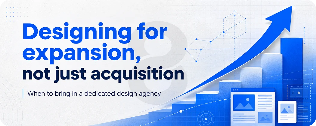
Designing for expansion, not just acquisition
One thing that separates mature SaaS design thinking from early-stage work is the shift from designing for acquisition to designing for expansion. Teams often deprioritize the upsell moment, the feature discovery prompt, and the settings page that surface advanced capabilities, while focusing on whatever next big feature comes in the product development cycle.
Moreover, users who integrate three or more features exhibit 70% higher retention at 12 months compared to single-feature users, according to research from MIT’s Sloan School of Management. That’s a design insight as much as a product one. Feature discoverability, the ability for users to find and understand capabilities beyond the core use case, is a retention lever that too many products leave untouched.
Furthermore, for teams building cross-platform products that span web and mobile, designing for expansion also means keeping the experience coherent across surfaces. A user who discovers a feature on desktop should find it without confusion when they’re on their phone. Inconsistency between platforms is a subtle but real friction point.
Read More: Web App Redesign Checklist: 10 Things to Demand from Your Design Agency
When to bring in a dedicated design agency
Not every startup needs to hire full-time designers before they’ve hit product-market fit. But the distinction worth making is between “we can’t afford design” and “we’re delaying design.” The first might be a real constraint. The second is a choice, and it has measurable costs in churn, activation rates, and rework cycles.
Working with a SaaS startup web app design agency that has direct experience with SaaS products can compress the learning curve significantly. You’re not paying for them to figure out that onboarding needs an aha moment. They already know that. You’re paying for them to figure out what your specific aha moment is and how to design toward it given your constraints.
Moreover, for commerce-enabled SaaS platforms where the purchase or subscription conversion moment happens inside the product, this expertise directly affects revenue. Teams rarely treat checkout and upgrade flows with the same rigor as the core feature set, even though they are among the highest-leverage design problems in any SaaS product.
| Signal | What It Tells You | Design Response |
|---|---|---|
| High signup, low activation | Users aren’t reaching first value | Redesign onboarding toward aha moment |
| High day-1 retention, low day-14 retention | Product is interesting but not habit-forming | Design for feature depth, email re-engagement |
| High support tickets on one feature | That feature’s UI is confusing | UX audit + redesign of that specific flow |
| Low upgrade conversion | Value of higher tier isn’t communicated in-product | Redesign upgrade prompts and feature gating UX |
| Users only use one feature | Other features aren’t discoverable | Improve navigation + contextual feature discovery |