



Ask a SaaS founder which screen they obsessed over before launch and you’ll usually hear about the landing page. Fair enough, that’s the screen that wins the signup.
But the screen a paying customer stares at every single day is the dashboard, and in a surprising number of products, it got designed in a hurry somewhere around sprint fourteen, by whoever happened to have bandwidth that week.
That gap shows up in the numbers fast. Users log in, stare at twelve charts they never asked for, and quietly stop coming back. The product works fine. The dashboard just never gave them a reason to care.
Our team has built dashboards for fintech products, healthcare platforms, logistics tools, and plenty of things in between. Do that long enough and patterns start repeating.
The process below is what those patterns eventually turned into, refined project after project until the dashboards coming out the other end were ones people opened without being reminded to.
We’ll walk through each step, cover the mistakes we keep getting hired to undo, put real numbers on cost, and get into what AI is currently doing to all of it.
Why Most SaaS Dashboards Fail Before a Single User Logs In
Here is an uncomfortable industry fact: Gartner survey found that BI and analytics adoption hovers around just 30 percent of employees in the organizations that pay for these tools. People are given dashboards. They simply do not use them.
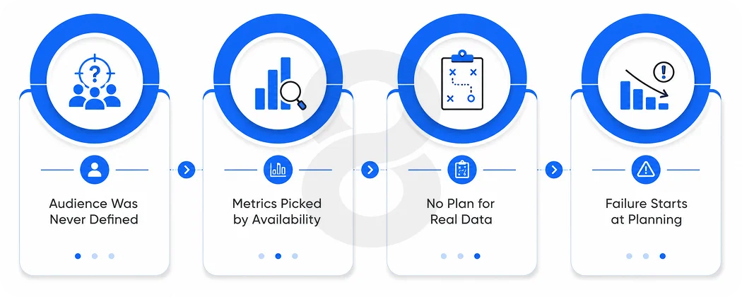
The failure almost never happens at launch. It happens in the planning phase, when three decisions get made badly or not at all:
The audience was never defined
Build a dashboard “for everyone” and watch nobody use it. The support manager checking ticket queues at 8 a.m. and the CFO pulling up quarterly trends are, for all practical purposes, different species. Cram their needs onto one screen and you’ve frustrated both of them, and frustrated users have a way of quietly never logging in again.
The metrics were chosen by availability
Teams display whatever the database makes easy to query, then wonder why users feel overwhelmed. The question was never “what can we show?” It was always “what decision does this screen need to support?”
Nobody planned for the second week
The dashboard demos beautifully with sample data. Then real data arrives with its gaps, outliers, and empty states, and the whole layout falls apart.
Everything in our process exists to catch these three failures before a single pixel gets designed.
What Makes SaaS Dashboard Design Different From Regular UI Work
Most screens in a product carry a single responsibility. Settings lets you change things, checkout takes the money, done. A dashboard never gets that luxury. It has to squeeze an entire product’s worth of data onto one screen without making the user feel like they’ve wandered onto a stock exchange floor.
That tension changes the job itself. Your general UI instincts still apply, sure, but SaaS dashboard design piles on pressures that ordinary screens never face. Three of them shape nearly every decision we make:
Density without noise
Dashboards carry more information per square inch than any other screen in a product. The design challenge is hierarchy: making the one number that matters today impossible to miss while keeping fifteen supporting metrics available but quiet.
Data is the interface
In most screens, the layout stays constant and the content changes a little. In a dashboard, the content is wildly variable. A chart that looks elegant with six months of steady growth looks broken with two weeks of sparse, spiky data. Good dashboard designers design for the ugly data, not the demo data.
It compounds daily
A confusing onboarding screen annoys a user once. A confusing dashboard annoys them every morning. Small friction multiplied by daily use is how churn quietly builds and small clarity multiplied by daily use is how habit forms.
And none of this is designer preference dressed up as strategy. When McKinsey studied the business value of design across 300 companies, the top quartile of its Design Index grew revenue 32 percentage points faster than industry peers over five years.
Apply that finding to SaaS and ask yourself where design actually touches your customer. The answer is the dashboard, every day, which makes it the screen carrying most of that financial weight.
Read More: Mobile App Design: The Complete Guide for Businesses
The 7-Step SaaS Dashboard Design Process We Run for Every Client
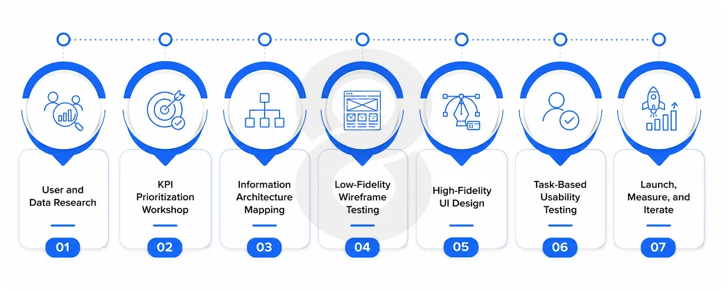
This is the actual sequence we follow. Some steps compress for smaller projects, but none of them get skipped, because every skipped step reappears later as a redesign.
Step 1: User and data research
Nothing gets sketched until two questions have real answers. Who opens this screen? And what are they trying to decide in that moment? They sound almost too basic to bother with, which is probably why so many teams skip straight past them.
Wherever access allows, we sit down with actual users, sort them into roles, and write down the three decisions each role leans on the product for. Those short lists end up steering the whole project.
In parallel, our team audits the data itself. What is actually tracked? How fresh is it? Where are the gaps? A dashboard promise the data cannot keep is worse than no dashboard at all.
This is also where our engineers assess the backend, because a real-time operational dashboard demands a very different data pipeline than a weekly reporting view, and that affects the software development work behind the interface.
Step 2: KPI prioritization
This is where projects get political. Every department head wants their number front and center and if you say yes to all of them, you end up with a wall of tiles nobody reads. So we hold a hard line: five to seven primary KPIs per role. That’s it. The rest goes into drill-downs, secondary tabs, or scheduled reports where it belongs.
To decide what makes the cut, we put every candidate metric through a workshop with a single filter question. Suppose this number doubled or cratered overnight, would the user actually change what they do tomorrow morning? No? Then it’s trivia. Interesting trivia, maybe, but trivia.
Step 3: Information architecture
Now we decide what lives where. The most important, most time-sensitive information anchors the top left, because that is where scanning starts. Related metrics get grouped. Actions sit next to the data that triggers them.
Roles and views get sorted out here too. One dashboard rarely covers a whole product; there’s usually an admin view, something for team members, and often a stripped-down client-facing version, each needing its own hierarchy.
Better to fight these battles on paper. A role structure that gets untangled during wireframing costs a few revised diagrams; the same discovery made mid-development costs weeks. That’s why role separation anchors the software design phase for us, well before anyone touches polish.
Step 4: Low-fidelity wireframes
At this stage everything is deliberately ugly. The metric names are real, the numbers are made up, and there isn’t a brand color in sight, because the only thing being judged right now is whether the layout itself works.
Then we hand these skeletons to actual users and watch what happens. We ask one question: “What would you do first on this screen?” Hesitation is a failing grade. So is a wrong guess. Either way, the fix costs us an afternoon here instead of a development sprint later.
Step 5: High-fidelity UI design
This is the step clients have been waiting for, when the gray boxes finally get dressed. The real work underneath is systematic, though.
We’re building a full component library that governs how charts look, how cards behave, what each color is allowed to mean, plus type scales and spacing rules, the whole kit. Color gets used sparingly and meaningfully, with red and green reserved strictly for status, never decoration.
Every chart type has to justify itself. Trends get lines. Comparisons get bars. Proportions occasionally get a donut, and almost nothing ever earns a pie chart with nine slices. We also design every empty state, loading state, and error state at this stage, because your users will meet those states before they meet your beautiful populated charts.
Step 6: Usability testing
Before development finishes, we run task-based tests: “Find last month’s churn rate.” “Identify which region underperformed.” “Export this view.” We measure time to complete and error rates, not opinions.
Ask someone whether a design is clear and they’ll say yes to be nice. Watch them fumble for forty seconds trying to locate the churn rate and you learn the truth. Behavior doesn’t flatter anyone.
Then the build starts and QA takes over a different kind of testing. Our engineers push the dashboard through structured software testing built around worst cases rather than happy paths. Hotel wifi that can barely load a chart. A table holding forty thousand rows.
Data arriving malformed from some third-party API at 2 a.m. A design that survives all of that is one you can put in front of paying customers.
Step 7: Launch, measure, iterate
A dashboard ships as a hypothesis. After launch, we track which widgets get viewed, which filters get used, and which sections get ignored. Anything unused for sixty days becomes a candidate for removal. The best dashboards we have built got simpler over time, not busier.
Operational, Analytical, or Strategic: Which Dashboard Does Your SaaS Need?
When a client brings us a failing dashboard, the diagnosis is usually the same before we’ve even opened the design files: wrong type for the audience.
Someone built an analytical deep-dive tool for support agents who only ever needed a live queue, or handed executives a wall of real-time noise when three trend lines would have covered it. The comparison below shows why the types don’t substitute for each other:
| Components | Operational Dashboard | Analytical Dashboard | Strategic Dashboard |
|---|---|---|---|
| Primary User | Frontline Teams, Support & Operations | Analysts & Product Managers | Executives, Founders & Investors |
| Core Question | “What Needs My Attention Right Now?” | “Why Did This Happen?” | “Are We on Track?” |
| Data Freshness | Real-time or Near Real-time | Hourly to Daily | Weekly to Monthly |
| Typical Content | Queues, Alerts & Live Statuses | Cohorts, Funnels & Segment Comparisons | North-star KPIs & Trends vs. Targets |
| Design Priority | Fast Scanning & Clear Alerts | Flexible Filtering & Drill-downs | Extreme Simplicity & At-a-glance Clarity |
| Interaction Level | Low (Mostly Monitoring & Acting) | High (Exploration is the Goal) | Minimal (Often Consumed Passively) |
Many SaaS products eventually need more than one type. That is fine. What never works is blending all three into a single screen, which is how you end up with an executive squinting at a live ticket queue while a support agent scrolls past quarterly revenue trends to find their own workload.
Read More: Custom Web App Design for SaaS Startups: Our Process Explained
Stop Adding Widgets: The Contrarian Rule That Saves Dashboards
Every dashboard project reaches the moment where a stakeholder says, “Can we also show…” and the honest answer that most agencies are too polite to give is no.
Our position, after years of doing this work: the value of a dashboard is inversely related to how much it tries to show. Every additional widget taxes the attention of every user on every visit, forever.
Think about the math for a second. One stakeholder glances at that extra widget maybe twice a month. A thousand users have to visually step over it every single morning. In the planning meeting it felt like added value. In production it’s a toll booth.
Held to consistently, this rule ends up removing something like a third of the widgets clients originally ask for. What happens afterward is the interesting part. We review every project post-launch, and in all the years we’ve been doing this work, nobody has asked us to put a cut widget back. Not once.
Read More: Web App Design Pricing in 2026: Packages, Hourly Rates & What You Get
How Much Does SaaS Dashboard Design Cost in 2026?
Anyone quoting you a flat price before understanding your product is guessing. What we can do is show you the three variables the price actually hangs on, because once you know where your project sits on each, you can ballpark the number yourself:
Scope of roles and views
There’s a world of difference between one dashboard for one type of user and a full enterprise setup where admins, managers, team members, and clients each get their own view. Every role you add drags its own research, design, and testing cycle along with it, so this variable moves the price more than most founders expect.
Data complexity
Static daily metrics from one database are cheap. Real-time streams, third-party integrations, and custom aggregation pipelines add engineering weight that no amount of design efficiency offsets.
Products that need their dashboard wired into existing tools like CRMs or payment systems also carry system integration work on top of the design itself.
Visualization ambition
If standard chart libraries can carry your product, and for most SaaS tools they can, this part stays affordable. The bill climbs once you want custom interactive visualizations, map-based displays, or animation-heavy data storytelling.
Rough numbers, then. A tight MVP dashboard tends to land in low five figures. Give it multiple roles and a handful of integrations and you’re looking at mid five-figure territory.
Enterprise builds with real-time pipelines and custom visualization work go beyond that, sometimes well beyond. On the calendar, expect around a month for an MVP and three to four months at the enterprise end.
AI is Quietly Rewriting the Rules of SaaS Dashboard Design
The biggest shift in dashboard design right now is not visual. It is conversational. Instead of hunting through filters, users increasingly expect to ask their dashboard a question in plain language and get an answer with the supporting chart attached.
This is not a fringe prediction. Gartner expects 75 percent of new analytics content to be contextualized through generative AI by 2027, which means the dashboards being designed today need to account for it now.
In our client work, AI shows up in dashboards in three practical forms:
Natural language queries
A search bar that accepts “show me churn for enterprise accounts last quarter” and returns the right visualization. This changes information architecture, because deep drill-down paths matter less when users can jump straight to an answer.
Automated insight surfacing
This one is the dashboard learning to speak up on its own. Instead of hoping someone scrolls past the right chart at the right moment, it taps them on the shoulder: “Signups from paid channels dropped 23% this week.”
A screen that used to be furniture starts acting like a colleague. We’ve been wiring this behavior into more and more client products through our AI development team, and users who’ve had it once don’t want to go back.
Predictive layers
Historical charts gain forecast bands. “Here is where MRR has been” becomes “here is where it is heading if nothing changes.”
The design implication cuts against instinct: AI makes minimal dashboards more viable, not less. When the system can answer ad-hoc questions on demand, the default screen no longer has to preempt every possible question with a widget. It can finally focus on the handful of numbers that matter today.
Read More: AI System Integration Services: What to Look for in a Development Partner
The 5 SaaS Dashboard Design Mistakes We Fix Most Often
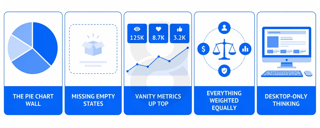
When clients bring us an existing dashboard to rescue, the diagnosis is almost always one of these five:
1. The pie chart wall
Six pie charts in a grid, each with five or more slices, none of them comparable to each other. Pie charts are the most misused element in dashboard design. Bars communicate the same data faster in nearly every case.
2. No empty or loading states
New users sign up, land on a dashboard full of zeroes and broken-looking charts, and form their first impression of the product from its worst possible state. Every widget needs a designed empty state that tells the user what will appear and how to make it appear.
3. Vanity metrics up top
Total registered users since launch is a number that only ever goes up and never informs a decision. Prime dashboard real estate should be reserved for metrics that can go wrong.
4. Identical weight for everything
When every card is the same size and every number the same font, the design is telling users that everything matters equally, which means nothing does. Hierarchy is the entire job.
5. Desktop-only thinking
Founders check MRR from their phone at night. Ops managers glance at queues from a tablet on the floor. A dashboard that collapses into chaos below 1200 pixels fails a meaningful share of its real sessions.
Read More: ERP System Development: Complete Guide for Businesses
How 8ration Handles SaaS Dashboard Design for Clients
8ration is a custom software development company and dashboard work sits at the center of most SaaS products we build. One working habit separates our projects from a typical design shop’s: the UI/UX designers share a room, and a daily standup, with the engineers who will eventually build the product, so the dashboard and the data pipeline feeding it get shaped together instead of in sequence.
On paper that reads like a staffing footnote. It ends up deciding a lot. Plenty of beautiful dashboard concepts die in development because the design assumed data the backend could not deliver at the required speed.
Because our design and engineering teams work under one roof, feasibility questions get answered during wireframing. Clients who are still shaping their product direction often start with software consulting to define what the dashboard should do before deciding how it should look.
Industry decides where the pressure lands. Build for fintech products and everything bends toward real-time accuracy and numbers an auditor could stand behind.
Build for healthcare platforms and compliance plus role-based data access start shaping choices you’d swear had nothing to do with either. Through all of it, the seven steps stay put. What moves is which constraint gets to be the loud one.
Launch isn’t goodbye, either. Once real users arrive, usage data starts having opinions, and we fold those opinions into quarterly refinement passes where widgets get promoted, demoted, or retired.
As a client’s product matures, the dashboard matures with it. More than one started life as a bare MVP view and runs today as a multi-role system with AI features built in.
Final Thoughts
Strip everything else away and a dashboard is your product’s opinion about what matters, published to every user, every morning. Show a metric and you’ve declared it important. Bury one and you’ve said the opposite. Users absorb that message whether or not anyone meant to send it.
As for the process itself, there’s nothing exotic in it. Understand the person on the other side of the screen. Be ruthless about which numbers earn a spot. Get the structure right before anyone starts arguing about colors.
Test against behavior, not compliments, and keep pruning after launch. The hard part was never knowing these steps. It’s holding the line when the eleventh widget request arrives with a VP’s name attached.
Hold that line and something quiet happens over time. The dashboard stops being a screen users tolerate and becomes the reason they open your product every morning, which is the least flashy retention strategy in SaaS and also the most durable one.