



There’s a scenario that repeats itself constantly in this industry. A business spends six months and a serious budget building an app. The screens look great in the pitch deck, the launch goes smoothly, downloads trickle in. Then the retention chart comes back and it’s a cliff. People installed the thing, opened it once and never returned.
Nobody on the team can point to what broke, because nothing broke. The app works. What failed was the design, and specifically the parts of it nobody screenshots for the deck. The signup flow asked for too much. The home screen greeted new users with nothing. And somewhere in those first sixty seconds, people quietly decided the app wasn’t worth keeping.
So this guide skips the theory and gets into the working details of mobile app design. Read it before you brief a designer and you’ll ask sharper questions and waste less money.
What Mobile App Design Actually Includes
Ask five people in a kickoff meeting to define mobile app design and you’ll collect five different answers. One person means the visual layer. Another means the entire path from install to daily habit. A third is quietly picturing the app icon.
They’re all describing pieces of the same thing and projects run into trouble precisely in the gaps between those definitions. It happens because each piece gets scoped, budgeted, and staffed as if the others don’t exist.
UI design handles the surface
UI design is the part everyone can see and argue about. When a stakeholder says an app feels premium or a user review complains it looks like it was built a decade ago, both of them are reacting to UI work.
UX design handles the journey
User experience design decides what happens when someone actually uses the app. How many taps it takes to complete a purchase. Where the signup wall sits. What the first minute of use feels like. Good UX work is mostly invisible, which is exactly why it gets underfunded.
Where businesses mix the two up
The confusion costs real money. A business hires a visual designer, gets gorgeous screens, ships the app, and then watches users get lost on day one.
The screens were fine the whole time, and the paths between them were broken. Mature software design practice treats both disciplines as one continuous job, because on a five inch screen, how something looks and how it works can’t really be separated.
Read More: UX Design for Trust: Principles Behind App Experiences at 8ration
Why More Than 90 Percent of Users Quit Apps Within a Month
Before you spend a dollar on design, take alook at this number for a minute. Business of Apps puts the share of users who give up on an app before the 30 day mark at more than 90 percent.
And on his website, Silicon Valley analyst Andrew Chen attests that a typical app loses 75 percent of its users inside the first three days after install.
Read that again. Three days. Most apps never get a month to prove themselves, they get a weekend. The uncomfortable part is that most of this churn is baked in before launch. A confusing first screen. A signup form that asks for too much too early.
A core feature buried three menus deep. Users don’t file bug reports about any of this, they just leave. And because they leave silently, teams keep blaming marketing when the real leak sits in the design.
This is also why serious teams put app design and retention planning in the same conversation from day one instead of treating design as a coat of paint applied at the end.
Good App Design Pays for Itself and McKinsey Proved It
Boards don’t fund design because it feels right, they fund it when someone shows them numbers, and McKinsey handed everyone those numbers years ago. The firm followed 300 publicly listed companies for five years, scored their design practices, and compared the results.
The top quartile design performers grew revenue 32 percentage points faster than their industry peers over that period and their shareholder returns came in 56 points higher.
The study found something less comfortable too. The market only rewarded the companies at the very top. Financial differences between mediocre, okay, and decent design were marginal, while the jump from decent to excellent was enormous.
Put bluntly, an okay looking app buys you almost nothing. You either compete on experience or you compete on price, and the second option is miserable.
Read More: Mobile App Development Timeline: 2026 Guide
The 6 Stages of a Mobile App Design Process
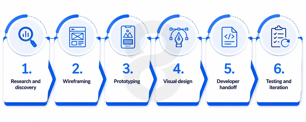
Agencies wrap this process in their own vocabulary and some of them charge extra for the vocabulary. Strip the branding away and the work underneath follows the same sequence at nearly every serious studio. Below is what each stage actually produces, and what it costs you to skip one.
1. Research and discovery
The temptation at the start of every project is to open Figma on day one and start drawing. Resist it. The first real job is answering three questions. Who is the user, what problem does this app solve for them, and what has the competition already figured out.
The deliverables here are user personas, competitor teardowns, and a feature list ranked by user need instead of stakeholder preference. It feels slow, and it’s the cheapest two weeks of the entire project.
2. Wireframing
Wireframes are the gray, deliberately ugly skeletons of your app. They map every screen and every path between screens without the distraction of color or branding. Structural problems get caught here cheaply. Moving a box in a wireframe takes minutes, while moving a feature in a coded app takes weeks.
3. Prototyping
Prototyping turns those wireframes into something people can actually tap. There’s no production code involved, only linked screens that behave enough like an app to fool a test user, and the fooling is the point.
Put the prototype in front of five people, watch three of them hunt for the checkout button in the wrong place, and you’ve just learned for a few hundred dollars what would have cost tens of thousands to learn after launch.
4. Visual design
Now the branding, color, typography, and motion arrive. Screens get pixel level attention, and a design system takes shape so every button, card, and input behaves consistently across the whole app.
5. Developer handoff
This is the stage where projects lose quality invisibly. The designs get packaged with specs, exportable assets, and documentation, and the developers build from that package. When the package is thin, developers guess, and a hundred small guesses later the shipped app only loosely resembles what everyone approved.
The teams that ship pixel accurate work treat handoff as a discipline of its own, with designers staying available while the build happens.
6. Testing and iteration
Launch day is the midpoint of design, never the end of it. Once real users arrive, the data starts talking. Heatmaps show what people ignore, session recordings show where they stall, and drop off numbers point to the exact screen where interest dies.
The design responds to all of it. Open the earliest screenshots of any app you love and compare them to today’s version. The distance between the two is this stage, repeated for years.
Read More: Mobile App Development Process – From Idea to Launch
How Much Does Mobile App Design Cost in 2026
We’ll give you the answer nobody selling design services wants to lead with. The price depends on scope, full stop, and any flat number quoted before someone has understood your app is a guess dressed up as a quote.
What we can give you are the ranges the market actually operates in, and they’re worth knowing because they protect you in both directions, from the freelancer whose price seems too good and from the agency whose price is simply too much.
| Design Scope | Typical Screens | Estimated Design Cost | Timeline |
|---|---|---|---|
| Simple App (MVP with One Core Feature) | 5–10 | $5,000–$15,000 | 2–4 Weeks |
| Medium-complexity App (Accounts, Payments & Dashboards) | 10–25 | $15,000–$40,000 | 4–8 Weeks |
| Complex App (Custom Animations, Multiple User Roles & Full Design System) | 25+ | $40,000–$100,000+ | 8–16 Weeks |
Certain requirements move the price fast, and it pays to know them before scoping starts. Custom illustration and animation work adds hours. So does designing for tablets and wearables on top of phones, meeting accessibility compliance, and supporting multiple user roles where an admin, a vendor, and a customer each need their own flows.
Then there’s regulation. Fintech and healthcare apps come with design obligations around security, disclosures, and data handling that a consumer app never has to think about.
Should You Design for iOS, Android, or Both First
Founders tend to file the platform question under business decisions, something to settle before design begins. In practice, it reaches deep into the design itself. Apple’s Human Interface Guidelines and Google’s Material Design take genuinely different positions on navigation and button placement and even what a back gesture should do.
Users have absorbed these conventions without knowing it. So an app that breaks them registers as slightly wrong even when nobody can say why.
As for which platform gets designed first, your audience decides that for you. iOS makes sense when your users cluster in markets like the US, where iPhones dominate and in app spending runs higher. Android earns the first slot when the goal is global reach or growth in emerging markets.
And when the budget only supports one design effort, cross platform app development with frameworks like Flutter lets one codebase serve both stores, though the design still needs platform specific adjustments to feel native on each side.
An honest take, after watching this decision play out over and over, is that founders overthink the platform and underthink the first session. A great onboarding flow on one platform beats a mediocre one on two.
Seven Design Principles That Quietly Decide Your App’s Fate
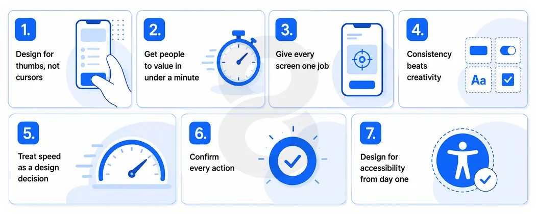
None of these will show up in a stakeholder demo, and every one of them shows up in your retention curve.
1. Design for thumbs, not cursors
Watch someone use their phone on a bus. One hand, one thumb, and that thumb rules the bottom third of the screen while barely reaching the top corners. This single fact of anatomy changed app design over the past decade. It’s why navigation bars moved to the bottom of the screen and hamburger menu has been fading into history.
Primary actions belong where the thumb already rests. Anything critical parked at the top of the screen will simply get used less, whatever your analytics team hopes. Tap target size matters just as much as placement. Apple’s guidelines recommend at least 44 points for anything tappable, and crowding smaller targets together guarantees mistaps and rage.
The flip side is worth designing for too. Destructive actions like delete or cancel subscription should sit slightly out of the easy zone, because a thumb that reaches everything effortlessly will also delete things effortlessly.
2. Get people to value in under a minute
The first session decides everything. If a new user hasn’t experienced the core value of your app within about sixty seconds, the odds of a second session collapse. The apps that retain well have made this a science. Headspace has you breathing within half a minute of opening the app, and Duolingo lets you finish a lesson before it ever asks who you are.
The practical move is to map your activation moment, meaning the single action that proves your app’s worth, and then ruthlessly clear the path to it. Defer the account creation, notification permission prompt, and the tour.
Every screen you place between a new user and that first moment of value is a screen where some percentage of them gives up, and you never get those people back.
3. Give every screen one job
A screen that tries to do three jobs will do all three of them badly. Each extra option a user faces is one more tiny decision, and tiny decisions pile into fatigue much faster than product teams assume.
The tell is the pause. When someone stops on a screen and think about what to tap next, the design has already lost them and it doesn’t matter that every feature on that screen technically works.
The fix is progressive disclosure. Show what the user needs right now and tuck the rest one tap deeper. Checkout flows show this well.
The ones that convert ask for one thing per screen, address, then payment, then confirmation, while the ones that cram everything onto a single scrolling form watch carts get abandoned. Keep cutting until every screen has one clear purpose and one obvious next step and when you think you’ve finished… cut once more.
4. Consistency beats creativity
Trust in an app gets built through repetition the user never consciously registers. A button that acts the same way on screen twelve as it did on screen one is doing quiet work the whole time. A clever new interaction on every screen builds confusion that the user definitely notices.
People form a mental model of your app within a few sessions, and every inconsistency, a back button that moves, a card that’s sometimes tappable and sometimes decorative, chips away at that model.
That’s the real return on a design system. With shared components, locked spacing rules, and a defined palette, designers stop redrawing the same basics and developers stop rebuilding them from scratch.
And creativity doesn’t get banished, it just gets aimed. Point it at the moments worth celebrating, like a first completed order or a streak hitting thirty days, and let everything structural stay reassuringly dull.
5. Treat speed as a design decision
Teams usually treat performance as an engineering problem, but a large share of how fast an app feels is decided in design. Users never time your app with a stopwatch, they judge how the waiting felt.
Two seconds spent staring at a blank white screen feels like something broke. The same two seconds behind a skeleton screen, where gray placeholder shapes sketch out the content on its way, barely registers as waiting at all.
Optimistic updates push this further. When someone likes a post or adds an item to a cart, show the result instantly and let the network catch up in the background. And design the waiting states on purpose. Loading, syncing, and retry screens are real screens that users will see thousands of times, yet they’re the ones most design files never bother to include.
6. Confirm every action
Every tap deserves a response, whether that’s a pressed state on a button, a subtle animation, a state change, or a pulse of haptic feedback. Silence after a tap reads as broken, and users respond to broken in a predictable way. They tap again. That second tap is how orders get duplicated, payments get double charged, and support tickets get written.
Microinteractions carry this job. A button dims the instant it’s pressed. A checkmark draws itself when the form saves. The password field gives a small apologetic shake when you typo.
None of these will ever appear in a feature list, yet stack them up and they separate an app that feels alive from one that feels like a mockup someone exported. They also happen to be the first line item cut when a deadline tightens, and their absence is exactly what users sense without being able to name it. Protect the budget for them.
7. Design for accessibility from day one
Readable contrast, support for larger text sizes, and screen reader compatibility widen your market and improve the app for everyone, including users who’d never call themselves impaired. Captions help in a loud train. High contrast helps in direct sunlight.
Larger tap targets help anyone walking while tapping. The accessibility standard worth designing against is WCAG, which asks for a contrast ratio of at least 4.5 to 1 for normal text.
The budget argument settles this on its own. Building accessibility in from the first wireframe costs almost nothing beyond attention, while retrofitting it into a shipped app means reworking colors, components, layouts, and code all at once.
Some markets also carry legal exposure for inaccessible apps, which turns a design nicety into a business risk you didn’t need to take.
Design Trends Worth Copying and the Ones You Should Skip
Trend lists age badly, so treat this section with a little suspicion, including the parts we got right. What follows has less to do with what looks fresh on design galleries and more to do with what’s actually earning its place inside shipped apps.
The pattern we keep seeing is simple. Trends worth adopting solve a real usage problem for real users, while trends worth skipping mostly exist to impress other designers.
There’s a budget angle here too. Every trend you adopt costs design hours, development hours, and testing hours, usually across two platforms.
Chasing three trends at once tends to mean shipping all three half done, and users notice half done work far more than they notice something missing. Pick the one or two that fit your product and do them properly.
Worth copying
Quiet AI personalization that adapts content to behavior without announcing itself. Dark mode as a first class option rather than an afterthought. Gesture navigation that follows platform conventions instead of inventing new ones.
And design that extends beyond the phone, since wearable app development keeps pulling core app moments onto watches, where every design decision gets compressed onto a tiny screen.
Safe to skip
Heavy 3D and glass effects on every screen, which tank performance on mid range devices for zero functional gain. Five screen tutorial carousels that users swipe through without reading. And novelty gestures nobody discovers without a manual. Trends age fast, and an app built on this year’s visual gimmick looks tired in eighteen months.
Read More: Mobile App Designs for Inspiration: 7 Trends Redefining User Engagement in 2026
The Mistakes That Kill Good Apps Before Anyone Notices
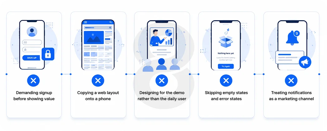
These come up in almost every app rescue project, and each one is invisible in a boardroom demo.
- Demanding signup before showing value. Let people experience the app first, then ask for the account when they have a reason to want one.
- Copying a web layout onto a phone. Desktop patterns like hover states, dense tables, and top heavy navigation fall apart on mobile.
- Designing for the demo rather than the daily user. The flow that impresses investors in three minutes often annoys real users by day three.
- Skipping empty states and error states. New users see an empty app before they see a full one, and that blank screen is your actual first impression.
- Treating notifications as a marketing channel. Every irrelevant push trains users to disable notifications or delete the app entirely.
How to Pick a Mobile App Design Partner Without Getting Burned
Portfolios lie by omission. Anyone can post polished screens online, so ask for links to live apps in the App Store and Google Play, then download two of them and use them for ten minutes. That tells you more than any case study PDF.
Then ask process questions. How do they test designs with real users before development? What does their handoff to developers look like? Who owns the design files when the project ends? A good partner answers all three without flinching.
You should also pay attention to their questions for you. A team that asks about your users and business model will design better app than a team that jumps straight to visual style.
Red flags worth walking away from include a a portfolio full of concept shots with no shipped apps and radio silence on how design decisions will be measured after launch.
Read More: What to Ask Before You Sign a Web App Design Contract (Most Clients Skip These)
How 8ration Approaches Mobile App Design

8ration is a custom software and app development company with design and engineering under one roof, which matters more than it sounds. Designs never get thrown over a wall to a separate development shop.
The same team that maps user flows during discovery goes on to build and ship the product through its mobile app development practice, so the design intent survives development intact. The team has designed and shipped live apps across categories with projects starting from user research rather than templates.
Prototypes get tested with real users before production code is written, and post launch analytics feed back into design revisions. Their case studies point to apps you can download from both stores today, which is a more useful signal than concept mockups.